Apple iPod touch 16GB Review
A few years back anyone who took even the slightest interest in computers was regarded with sniggering suspicion and treated as a figure of fun. To employ a much-overused term, they were seen as 'geeks': a group of hairy, unwashed, pimply, young and middle-aged men indulging in a minority hobby.
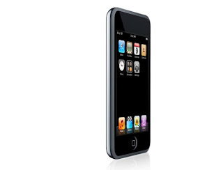
 And in the company's latest gadget - the iPod touch - Apple has taken that metaphor and turned it into reality. For its flagship flash-based media player it has dumped the click wheel in favour of a touchscreen-drive user interface. It's the one you've read so much about on the iPhone, but here without the hamstrung non-3G phone stuff.
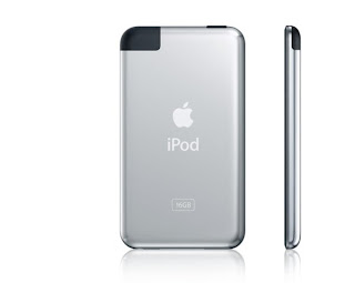
Great, but isn't £279 a lot of cash to spend on a 16GB media player? Wouldn't you be better off with an iPod Classic? Well, there's not much in terms of raw specifications to distinguish it from the rest of the iPod range. You get the usual limited range of music file format support - just AAC, Apple Lossless and MP3 for music and H.264 and MPEG4 files for video. There's no FLAC, Ogg Vorbis or WMA support, nor any for DivX or WMV, MPEG1 or 2. Although very beautifully designed and fantastically thin at just 8mm, its pocket footprint is actually a little larger than a standard iPod, measuring 62mm wide by 110mm tall. And battery life is nothing to write home about either, weighing in at up to 22 hours for audio and a par-score five hours for video.
 So can a simple touch screen really be worth paying this much for? The short answer is yes, but you don't want the short answer, so here's why... The touch's touch-sensitive control system really is a revolution in user interfaces - I can think of no other way of describing it. In the same way that Apple's clickwheel has never really been bettered, I can't see any other manufacturer coming up with anything superior to this for years either. It's the best touch sensitive interface I've ever used on any device and the software behind it is some of the best put-together on any pocket device I've used too.
Cover Flow, of course, has made the transition from iTunes to the touch with its effective, Rolodex-like browsing as it has with the rest of the iPod range, but the touch sensitive screen adds another dimension in the touch. Click into the music browser, turn the touch on its side and an internal sensor rotates the screen into landscape format and turns Cover Flow mode on automatically. Browsing your music is then a simple matter of flicking your finger across the screen to the right or left. Flick hard and the Rolodex spins quicker; drag your finger slowly and the animation is more sedate. And the whole lot moves as if it were governed by real-life physics, gradually slowing to a standstill, rather than abruptly stopping.

This system works just as well in the rest of the touch's menus. Whether it's scrolling up and down through lists of albums, creating playlists, browsing photographs or videos it works superbly well. You never find yourself stabbing the screen with no response, and it's been designed so that even those with the fattest fingers can click buttons, links and options accurately. There's a whole host of lovely touches that'll get you cooing with delight too, such as the unlock control, which requires you to drag a slider across the screen - no fiddly hardware switches here - and the on/off settings switches which you slide from left to right instead of simply pressing. The one hardware control is a single button to the side of the screen, which is employed as universal back/exit button.
But the touch really comes its own when you start to take advantage of the Wi-Fi connection to browse the internet via the built-in Safari web-browser and the mobile version of the iTunes store. As before, a flick of the finger has you scrolling up and down lists with ease and, amazingly, even tiny text links seem relatively easy to click - you don't need the precision of a Harley Street surgeon to get to the page you want. Again, Safari has been revamped and adapted almost perfectly for the touchscreen interface. Tap the address bar at the top of each page and a keyboard pops up with a remarkable effective QWERTY keyboard. As you type on this, the letters pop up above your finger so you know exactly what letter/number you've just hit.
 If you can't read the text on the 3.5in, 480 x 320 resolution widescreen, you just pinch your fingers together, spread them apart on the screen and, hey presto, you zoom in; reverse that manoeuvre and you're zoomed out again. The touch pulls off what no other pocket device or smartphone I've used can - browsing the web with your fingertips without having to resort to using a stylus.
Of course all this would be pretty useless if the music and video players weren't much cop. But here it is every bit as good as any other iPod. Akin to the rest of the recent iPod releases, it doesn't go very loud, but in terms of balance and clarity there's nothing wrong with it at all. If I was being picky, I'd say it lacks in the dynamics department, and there's a small amount of background hiss that I haven't heard on the other iPods, but its perfectly musical and there's very little else to complain about.

I kicked off the listening tests with a touch of undemanding country and western and Shawn Colvin's Wichita Skyline. The pianos, and the mix of acoustic and electric guitars came across well. Perhaps there wasn't quite as much clarity and presence as with the Trekstor Vibez, my current benchmark for sound quality, but it was still very good. Moving onto something more fast-moving - Green Day's American Idiot - and the touch's weaknesses were exposed more, with less punch and bite than the Vibez and the sound a little compressed, but once again the differences are small and unless you've a really good pair of headphones (replace the white ones that come with it - they're not very good), this probably won't bother you in the slightest.

As for video, the touch's 3.5in screen is perfect. I'd be happy watching TV shows or movies on it: it's vibrant, bright, crisp and colourful and considerably larger than the one on the standard hard disk-based iPod. Most importantly, perhaps, though you'll be doing a lot of re-encoding of files, videos play back at up to 30 frames per second, which is better than many cheaper video-enabled pocket players can manage.
0 Comments:
Previous Posts
- Motorola ROKR Z6 pics and video
- Sony Ericsson W750 concept
- Tons of pics of the candybar Nokia N95 ripoff
- The latest super radio phone
- Some more live pics of the Sony Ericsson Chocolate...
- Live pics of the Chinese NBA phone
- The tphone goes white
- One really convincing Nokia N73 clone
- Two new Symbian OS v9 books from Symbian Press
- DivX Certifies Samsung Handset with Video Capability

Post a Comment