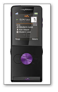
Sony Ericsson W350i Is More Walkman Than Phone
 On first impression, the Sony Ericsson W350i is the phone that doesn’t look like a phone. It appears very much to be a slimline, lightweight, stylish, but perhaps slightly cheap looking MP3 player!
You’d be forgiven for thinking that anyway.
As it happens, the lower front panel folds down to reveal the number keypad, an unusual setup for a phone, and one that suggest that the aim is to promote the Sony Erisson W350i as equal Walkman and phone. The reason I mention this is that from my point of view the usability of the phone is paramount and a music player will always be an add-on (I’m an iPod user!). I think I would find a fold-out panel intrustive when using the phone, but I can understand why Sony Ericsson would go with this.
 Whenever I have used a music player on a phone I have been frustrated by the difficulty in operating it on the move, having to go into the interface in order to skip a track for example. The W350i by contrast looks very user-friendly for music listeners with its external music keys.
It’s an attractive design and it comes in four colour combinations as well, and unlike some of Sony Ericsson’s recent offerings, they’re all pretty easy on the eye! The colours are Electric Black (Black and Orange), Hypnotic Black (Black and Purple), Ice Blue (very smart!) and Graphite White.
 In terms of phone features there’s not a huge amount to shout about: 1.3 megapixel camera, 1.9″ 176 x 220 display, GPRS & EDGE and expandable memory up to 2GB.
I’ve got to say I like it though. It’s neat, it’s lightweight, it’s good looking and it’s bound to be pretty cheap as well. Should be available in Q2 2008.
Labels: sony ericsson
Previous Posts
- Luxury Sony Ericsson Concept – An Eiffel Tower in ...
- Dual SIM Motorola VE75 officially released, only i...
- Sony Ericsson W350i Review
- T-Mobile Set to Offer Sony Ericsson TM506 in Black...
- Motorola Red Phone
- Samsung to Ship M150 CandyBar Phone Next Month
- Details on Verizon's LG Voyager refresh - new firm...
- Diamond TF3D Config lets you customize HTC Touch D...
- Documents To Go Premium Edition 4 for UIQ announce...
- LG Ku990-viewty/beauty??
